Posts

Somewhere

Image
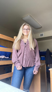
 This was the original photo of me This is the original photo of what I added myself to.  I decided to do a scene from Criminal Minds as it is my favorite TV show and this was one of the final scenes of the entire series with the cast in an elevator. 

Photoshop HW 2

Image
 I think it would be very hard to Photoshop myself into this image because of all of the text that is on it.  This gave me an idea for the "Somewhere"project because I think it would be cool to do something in France, specifically in Paris and I like how the Eiffel Tower is still in the photo but not the focal point of the image.  I thought this was really funny because you would expect them to just photoshop him next to her or something along those lines not her dropping him.  This cloud effect is something I might want to recreate because I think it gives a good illusion and adds a lot to the image. 

BW To Color

Image
I decided to use this picture as it had interesting background to be highlighted by the different colors that I chose. I chose each of the color combinations because I liked how to of them you were able to show contrast in the colors and one with more similar colors with all blues and greens.   

TagBrush

Image
This is my TagBrush with my logo. It is the first two letters of my hebrew name and I chose it to be blue because it is my favorite color and I think it looked good with this design. 

Propaganda Poster

Image
  I decided to do my poster as a pro Israel propaganda poster because it is something that I feel strongly about and want people to be more aware of the issue at hand. I also included the Israel flag and my hebrew name, Davida Brucha, into it.  This is the original photo that I made self-portrait in Illustrator off of.  This was my main inspirational image for my poster.

Personal Logo

Image
  My logo is the first two letters of my hebrew name which is Davida Bracha. I have a full black and white version, one with black and color and a full color option. I decided to do a slightly different approach compared to a lot of people in the class using their initials by using my Hebrew name instead of my English name. My faith is very important to me and a big part of my life so I wanted to incorporate that into my logo. 

Calligram Project

Image
For this calligram project, I wrote my letter to show my future self what progress I had made as a person in the last 20 years. I chose to do it in the shape of a heart because it is to show how I feel about myself has changed as a person for the better. On the right side of the heart is the entire letter that I wrote. On the left side of the heart is the message from my letter that I think is the most important and the last line of my letter: You deserve to be happy!! Lastly, I chose for the entire design to be blue as it is my favorite color.